Yep, still without a camera. But that's okay, I have the world of Google Images to get me through!
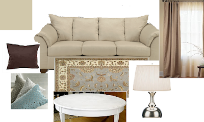
So, for your consideration, I present: The Living Room Mood Board
The wall color is Benjamin Moore's Frappe made with Behr all in one paint and primer. It is much lighter than it is showing... there is more of a cream tone.
The couch is from Ashley Furniture and was our FIRST purchase together from 4.5 years ago! We got the whole set but I will be editing down so it's less matchy.
We have chocolate brown and steel blue throw pillows. Both are from Sears, just last week to be exact. The brown are sturdy cotton for $7 and the blue are 100% silk for... wait for it... $13!! I literally squeaked and loaded my arms up with 4 of these beauties.
We ordered the area rug from Overstock.com this evening ... we were originally looking for something a bit more basic with less print but our budget and color demands, this transitional-style area rug should do! If not, they have a great return policy :)
The lamp is similar to the lamps I purchased from the Christmas Tree Shop a few months back. They are tall and curvy with great white shades. And for $14 each, I was S.O.L.D.
The white, round coffee table is my project for this weekend. I purchased a round, solid wood coffee table from craigslist and will be giving it a new white finish.
Finally, I AM IN LOVE! Yes, with George, but even more so with the drop cloth curtains! I saw this idea from The Walton's blog (by way of Young House Love). I bought, washed, dried, ironed and hung the curtains but they were lacking body and they were a bit too long. So I got some hemming tape and brought the bottom up 6 inches and the top 4 inches. It was easy as pie and made ALL the difference... I am smitten and plan to do the same for our French doors in the dining room.
So I know it looks a little shabby-chic, but I promise, I am not into the distressed look. Washed out, sure! But not beaten to death. I like things to look new or in their best possible shape.
I also know what you are thinking: neutral overload!
I know, I know. But I promise I am planing on injecting more color! I love the idea of pairing the cool blue with spring-silvery sage greens and little pops of red.
So, I'm not a pro, but what do you think? Good base to play with other colors or are we WAY off base?
Discuss...

No comments:
Post a Comment